Introduction to Power BI – DEC Report Video 8

Introduction to Power BI – DEC Report Video 8
Intro to Power BI #8 – 15 mins 58 secs
Video 8 – Adding new visuals / Edit Interactions / Publish and Share
- Return to Delivery Methods Analysis – copy Data Skills Percentage visual
- Paste on a new page
- Rename page to Data Skills By Year
- Add a Card
- Add the field Delivery Method to the card.
- Notice that the default for a text field on a card is ‘First’
- Update summarisation from First to Count ( not Count Distinct )
- Add Delivery Method to Filters on this Visual and select Hybrid
- Format Card
- Height – 150, Width 300
- Add Title ‘Hybrid’
- Effects – border | shadow
- Remove Category Label
- Copy Visual and paste 3 times
- Update each new visual – In Person, Online Self-Directed
- Remember to update Filter on this visual appropriately
- Ensure lefty hand visual and right hand visual are at the edges
- Select all 4 cards – hold CTRL
- Go to Format ( Ribbon ) then Align, then Distribute Horizontally
- Go to ‘Get More Visuals’ and search for Play Axis
- Add to report, and add to page
- Change Animation Settings to Loop
- Add colors
- Press play
- Sit back and be amazed 😊
- Copy Clustered Column Chart and paste into space
- You can use ‘Align’, then Distribute Vertically to clean up dashboard
- Select Play Axis, then Format, Edit Interactions.
- On one of your Clustered Column Charts change Highlight to Filter
- Uncheck Edit Interactions
- Play your Play Axis – notice the differences
- File Save
- Publish and choose ‘Your Workspace’
- Open the link that PBI provides you with
- Your are now in PBI Service aka Fabric
- The finished dashboards can be
- Shared as dashboards within your organisation
- Exported into PowerPoint as either static images or ( really cool ) live dashboards
- Exported as PDFs

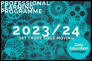
Turning Data Education in Scotland upside down
Offering a flexible alternative to the traditional fixed in-person classes
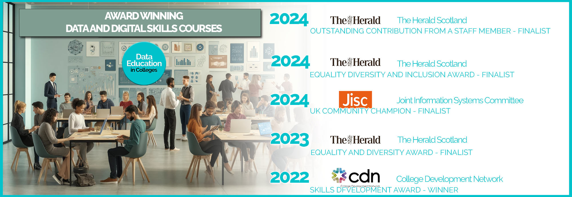
Skills Development Award Winners - CDN 2022
Data Education in Colleges are proud to have been shortlisted for 6 awards - both in Scotland and UK-wide - and won the College Development Network's Skills Development Award in 2022